Matching couple outfits have an image problem, and it’s earned. The “his and hers” novelty tee. The identical Hawaiian shirt in the identical print. The head-to-toe twinning that makes everyone in the photo look like they’re on a themed bus tour. There’s a reason people cringe, and pretending otherwise doesn’t help anyone.
But the alternative most couples default to is worse: two people who clearly got dressed in separate rooms, standing in the same photo, one in a slip dress and one in board shorts. That reads as disconnected in a way that no amount of individual good taste fixes.
Coordination is the middle ground, and it isn’t guesswork — there’s a system to it, and it runs on four levels. Below are 26 ideas organised from barely-there to genuinely matching, plus a breakdown of exactly what makes matching go wrong, how to pick the right level for your relationship, and what to do when only one of you is into the idea.
Why Matching Outfits Go Wrong
It’s worth naming the actual mechanism, because once you can see it, you can avoid it in any outfit — including ones that aren’t on this list.
Identical garments read as a uniform
Uniforms signal that somebody else assigned the clothing: a team, a tour group, a workplace, a wedding party. That’s the precise feeling people are reacting to when they call matching outfits cringe. It’s not about the colour or the garment, it’s about the implication that neither of you chose it.
The moment the garments differ — even slightly, even just in how they’re styled — the brain reads it completely differently. Two people who happen to complement each other. That’s a one-item change with an enormous swing in perception.
Novelty print does the joke for you
Anything with text, hearts, arrows, “his queen,” or a cartoon of two people holding hands removes every possibility of subtlety. The clothing announces the relationship instead of letting the photograph carry it. It also dates instantly — novelty graphics are the fastest-ageing thing you can put in a photo you’ll still be looking at in ten years.
Same colour plus same silhouette flattens the frame
This is the technical one, and it’s why so many well-intentioned matching outfits photograph badly. If you’re both in the same shade and the same shape, you merge into a single visual block. The image has no depth, no separation between you, nothing for the eye to travel across.
The fix is almost never colour. It’s texture and silhouette. Two people in identical cream where one outfit flows and the other is structured photographs beautifully. Two people in identical cream where both outfits are the same shape does not.
Mismatched formality is the actual cringe
Here’s the thing most couples get backwards. The thing people genuinely notice in a photo isn’t clashing colour — it’s one person clearly dressed up and the other clearly not. That gap reads as a disconnect, and no amount of colour coordination rescues it.
If you fix only one thing before your trip, fix this. Agree on how dressed up each day is before either of you starts getting ready, not while one of you is already in a slip dress.
Doing it every single day
Even genuinely good coordination gets heavy across an entire album. Twenty photos of a coordinated couple starts to feel like a concept rather than a holiday. Coordinate for the days you’ll actually photograph, and dress like yourselves the rest of the time.
The 4 Levels of Coordination
Before the ideas, it helps to know which level you’re aiming for. Most couples do best at Level 1 or 2 and never need to go further.
Level 1 — Shared palette. You draw from the same colours. Nobody can tell you planned anything. Zero negotiation required while getting dressed.
Level 2 — Shared texture or fabric. Same material, different colours and garments. Reads as coordinated to anyone paying attention, invisible to anyone who isn’t.
Level 3 — Same colour, different everything else. Obviously deliberate. Photographs strongly. Requires the silhouettes to genuinely differ or it flattens.
Level 4 — Genuinely matching. Same garment or same set. Works in specific contexts and fails badly outside them. Use sparingly and with intent.
1. Two Neutrals, Freely Mixed
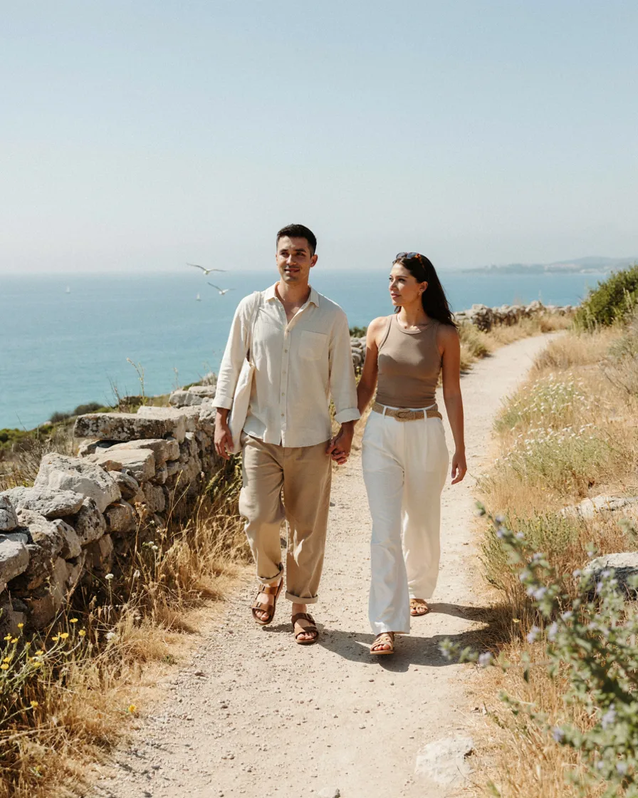
Pick cream and tan before the trip. Both of you pack only within those two colours plus whatever you’re already wearing on the bottom. No two pieces between you are the same, and every photo still looks composed.
This is the single most useful idea on the list because it requires no daily decisions. Once the suitcases are packed, whatever either of you grabs will work with whatever the other grabbed. That’s the entire benefit.
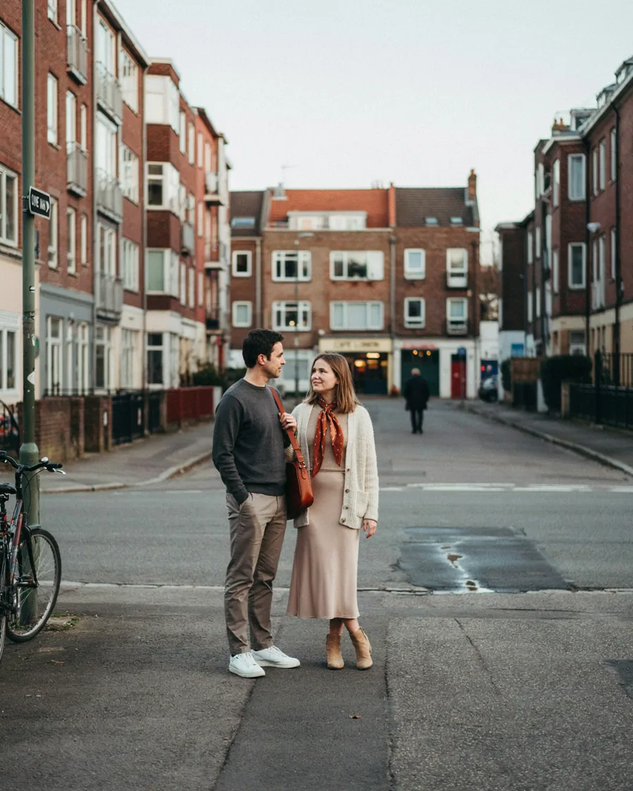
Everything neutral except one item each in the same accent — a rust bag and rust sandals, a green cap and a green shirt. The accent creates a visual link across the frame without either outfit being about the colour.
Works best when the accent sits at different heights on each of you. Both carrying it at waist level is less interesting than one at the head and one at the feet.
3. Matching Shoes Only
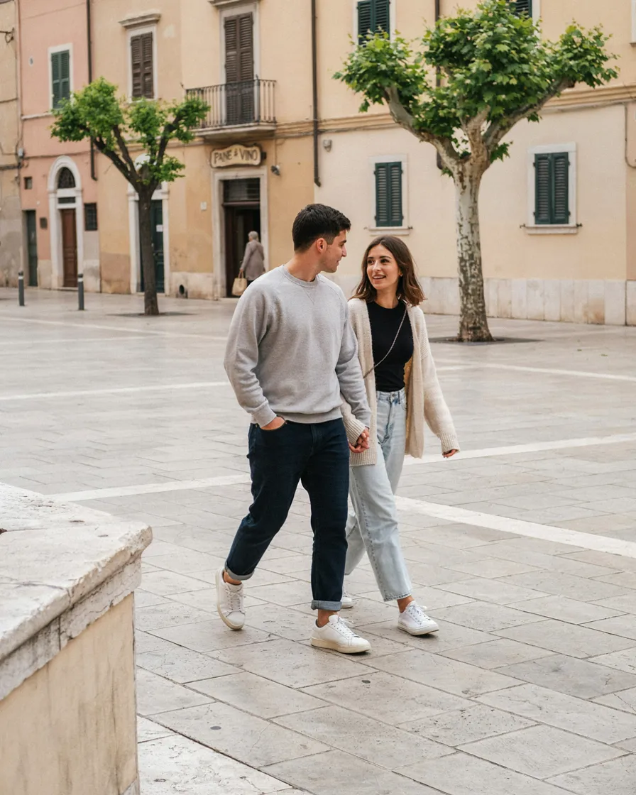
White sneakers on both, everything else entirely independent. The lowest-commitment coordination that exists, and it genuinely registers in full-length photos because shoes anchor the bottom of the frame on both people.
Practical bonus: this is also the correct footwear choice for almost any walking-heavy travel day, so you’re not compromising comfort for the photo.
4. The Same Metal
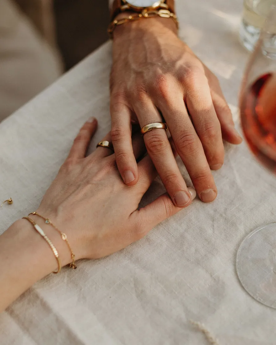
Both in gold jewellery, or both in silver, with completely unrelated clothes. Almost invisible when you look at either person individually, clearly present when you see them together.
This one survives the whole trip without any planning, since most people wear the same jewellery daily anyway. Agree on it once and you’re done.
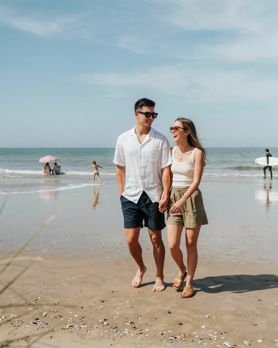
The same frame shape in different colours. Sunglasses sit at the centre of every face-forward photo, which is why this works far harder than a small accessory should.
Keep the frames genuinely the same shape and the colours genuinely different. Same shape and same colour tips into Level 4 without meaning to.
6. One Palette, One Print
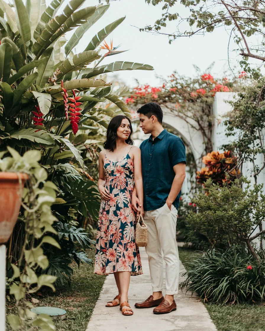
One person in a print, the other in a solid colour pulled directly out of that print. The most sophisticated version of matching on this entire list, and it’s the technique stylists use constantly.
Pick the solid from a secondary colour in the print rather than the dominant one. If the print is mostly navy with small coral flowers, the coral is the more interesting choice.
7. Both in Linen
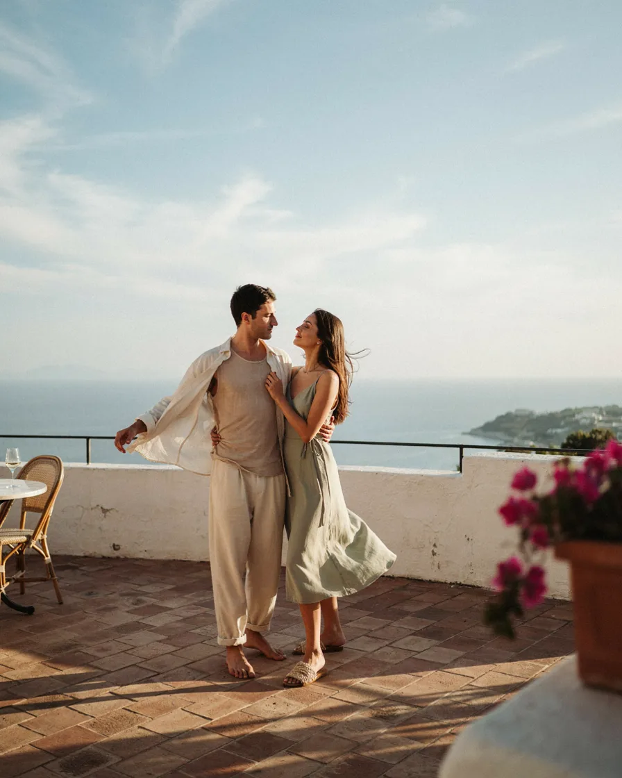
Different colours, different garments, same fabric. Linen has such a distinctive drape and crease that it coordinates entirely on its own — the material is doing the work, not the styling.
This is the strongest option for hot destinations because it’s also the correct practical choice. Coordination that doesn’t cost you comfort is coordination you’ll actually maintain past day two.
8. Denim, Split
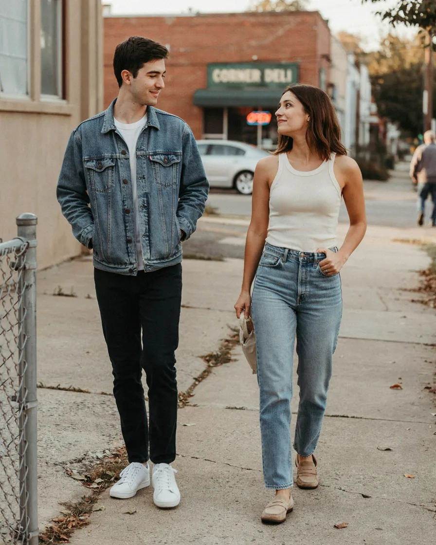
Denim jacket on one, jeans on the other. You share the fabric without both committing to a full denim look, which is the version that goes wrong.
The person in the jacket should wear a non-denim bottom, and the person in jeans a non-denim top. Cross them and it works. Stack them and you’re both in a Canadian tuxedo.
9. Both in Knit
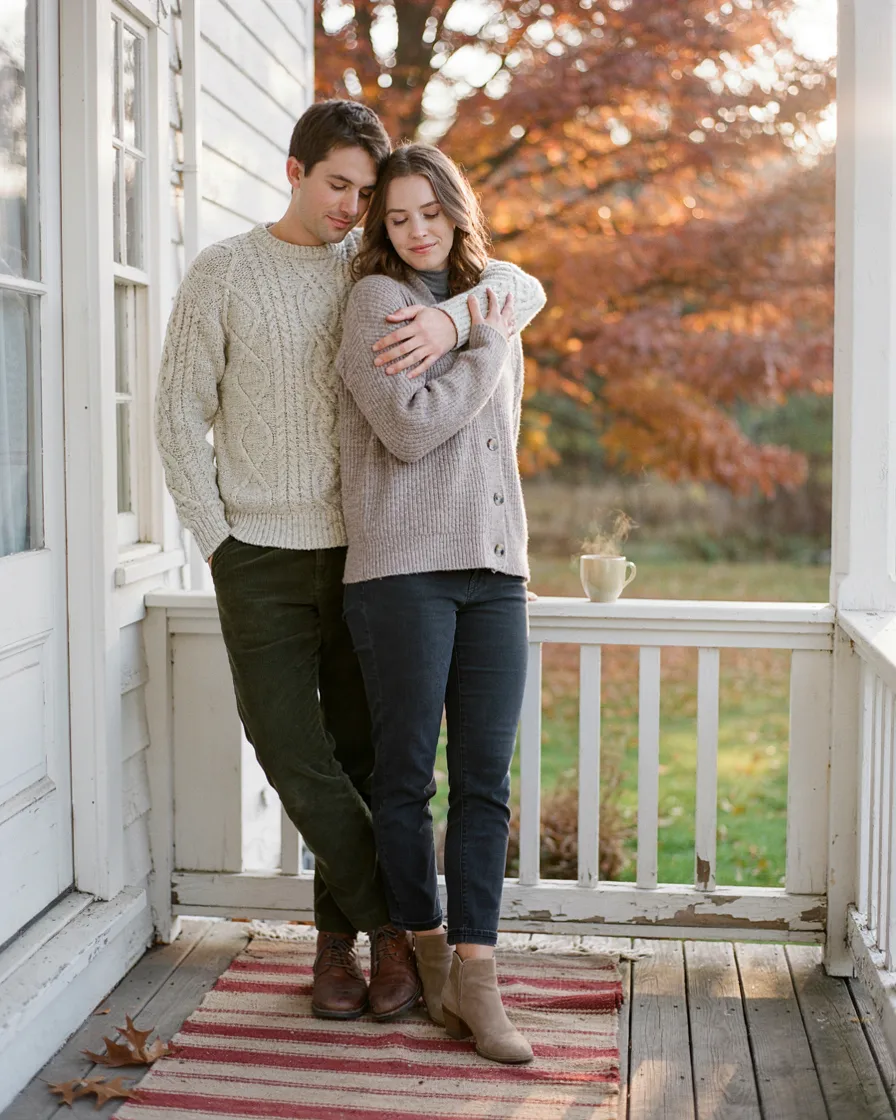
Chunky cable on one, fine rib on the other. Shared category, obviously different weights, and the texture contrast gives the photo depth that same-fabric pairings can lack.
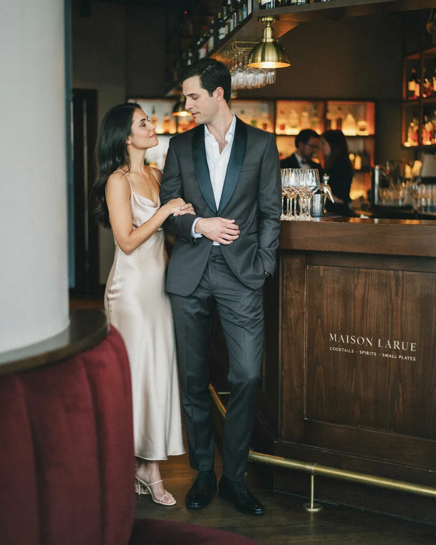
A satin shirt and a silk dress. Both catch light the same way, and in an evening photo that shared reflectivity is what actually registers — far more than the specific colours.
This is the best Level 2 option for dinners and nights out, because sheen photographs well in the low, warm, directional light most restaurants have.
11. Both in Crochet
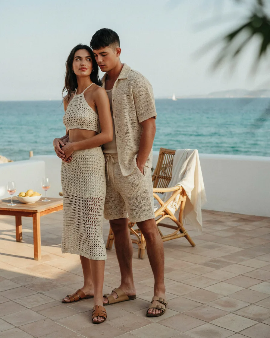
Crochet vest and crochet cover-up in different colours. The texture is distinctive enough that it links you even across quite different garments and shades.
12. Leather, Different Cuts
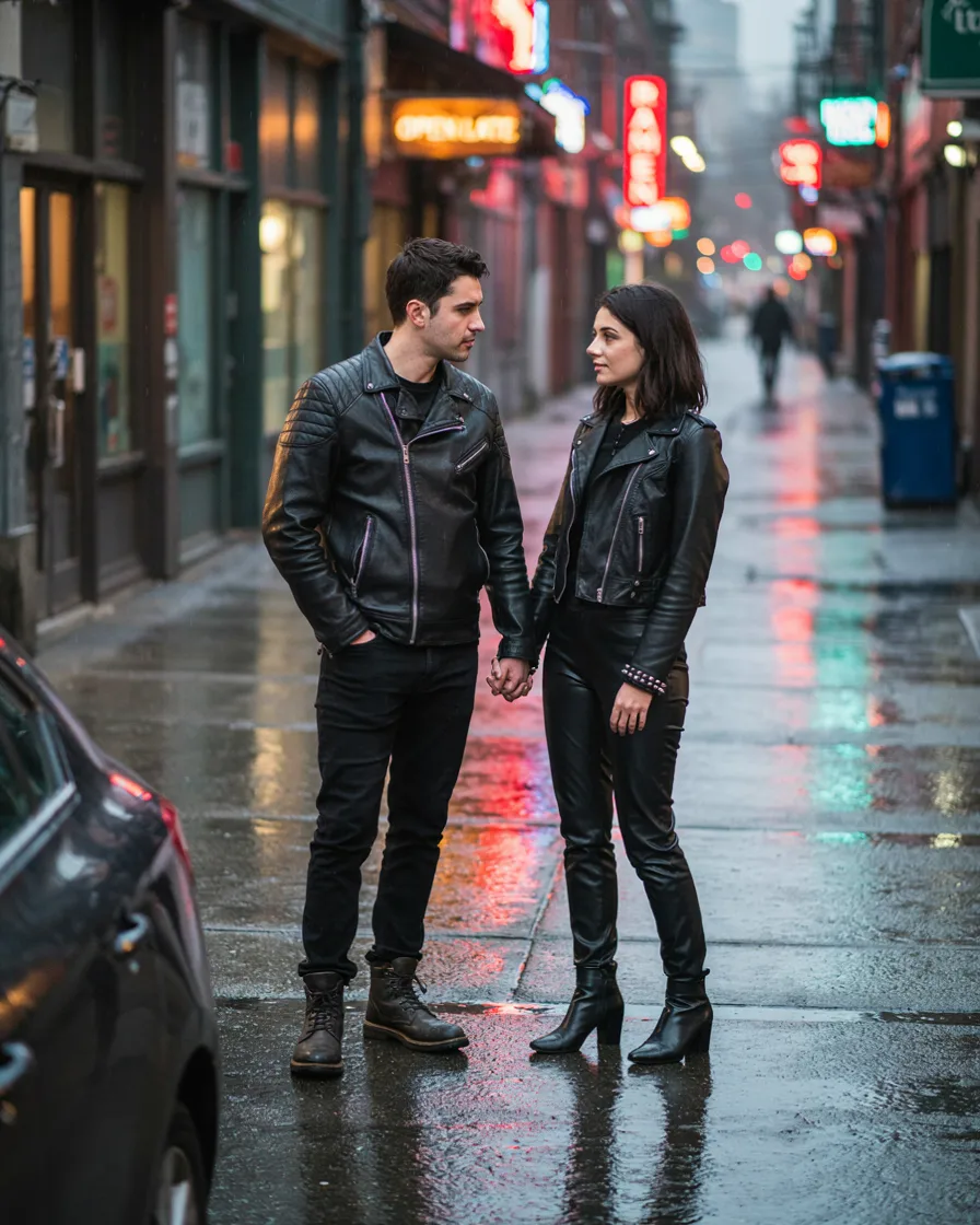
Two leather or faux leather jackets that share nothing but the material. Works especially well for evening city photos, where the shared finish reads against artificial light.
Make the cuts clearly different — a cropped moto next to a longline. Two similar biker jackets slides into Level 4 territory.
Level 3: Same Colour, Different Everything Else
13. All White, Two Silhouettes
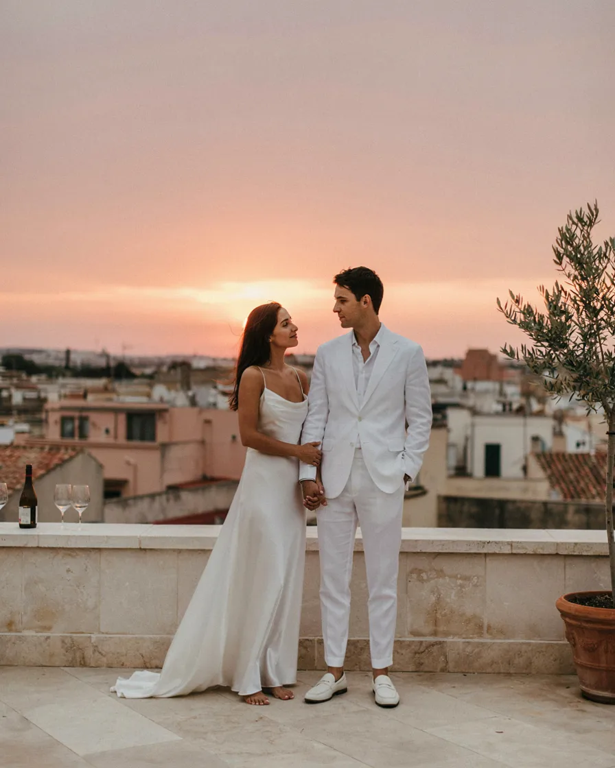
Both head-to-toe white, but one flowing and one structured. The silhouette contrast is the entire reason this works instead of flattening — without it, you’re a single white shape in the middle of the frame.
One practical warning: thin white cotton goes transparent in backlight, and golden hour is backlight by definition. Line it, layer it, or pick a heavier white.
14. All Black, Two Textures
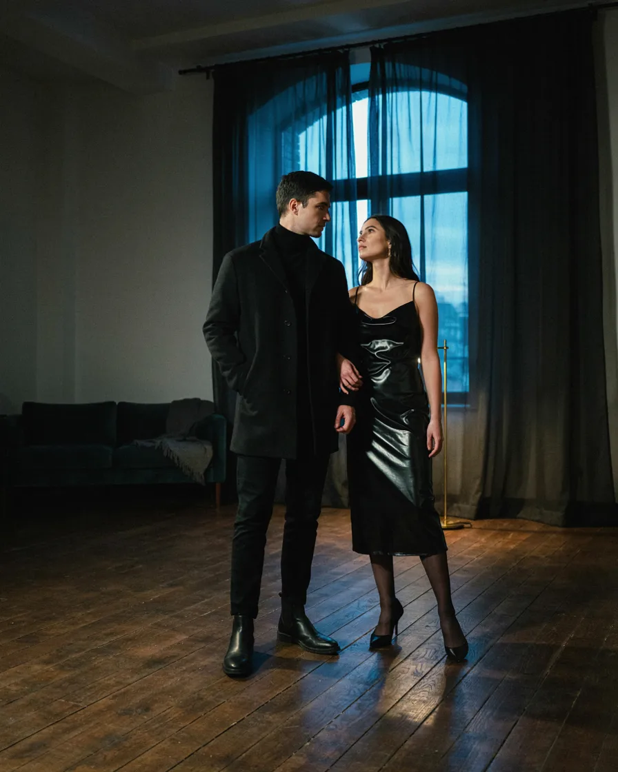
Black on black, but matte beside sheen, or knit beside leather. Black is the most forgiving colour to coordinate in and the least forgiving to photograph, so the texture split matters more here than anywhere else.
15. Two Shades of One Colour
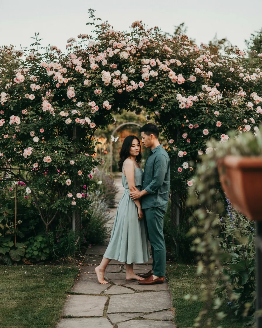
Both in green — sage on one, forest on the other. Tonal rather than identical, which is the whole trick, and it’s noticeably more interesting than both of you in the same green.
Aim for a genuine gap between the shades. Two greens that are almost but not quite the same looks like one of you got the colour wrong.
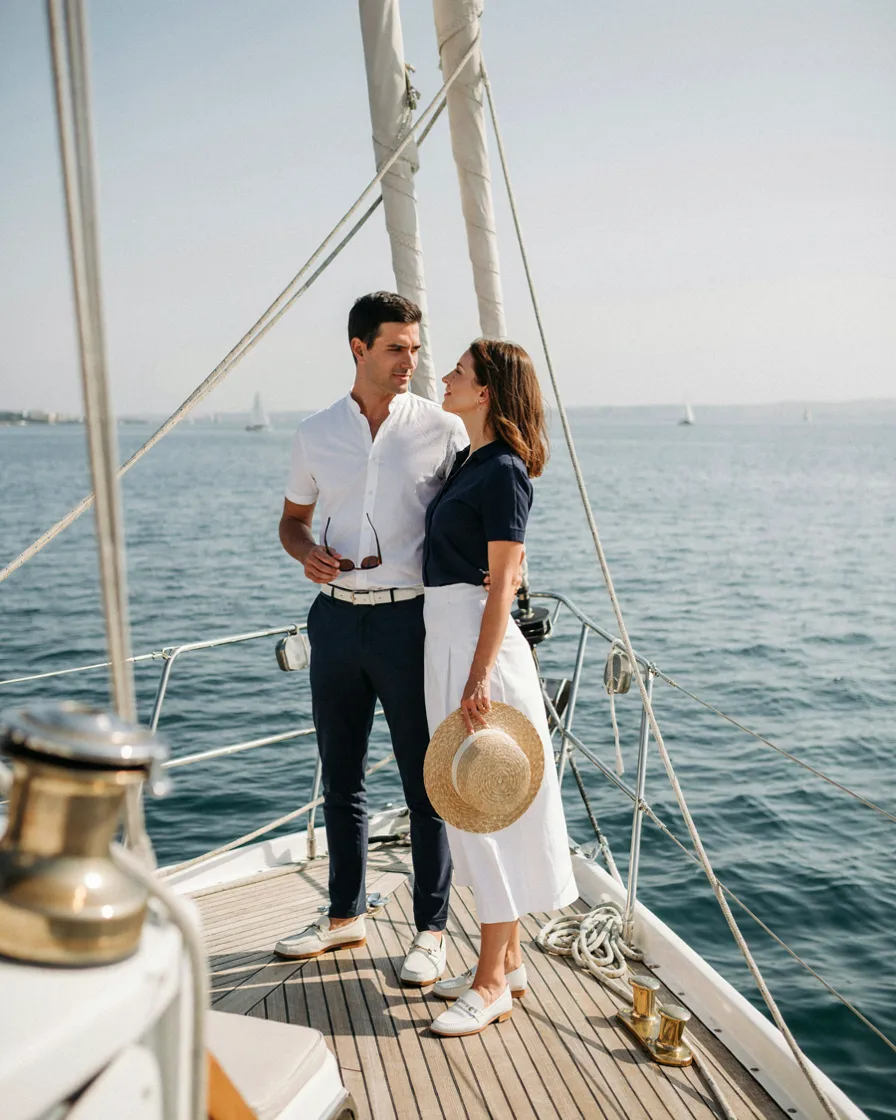
One in a navy top with white bottoms, the other the exact reverse. Playful and clearly deliberate without ever reading as a costume, and it photographs well against water.
17. Monochrome Beige
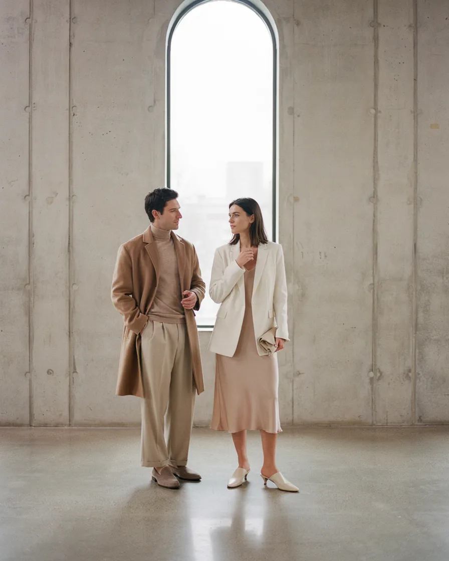
Head to toe beige on both, layered in different tones — oatmeal over sand over camel. Quiet, expensive-looking, and consistently the most-saved version of this idea.
Layering is what makes it work. A single flat beige on each of you is the version that goes wrong.
18. The Same Colour, One Dressed Up
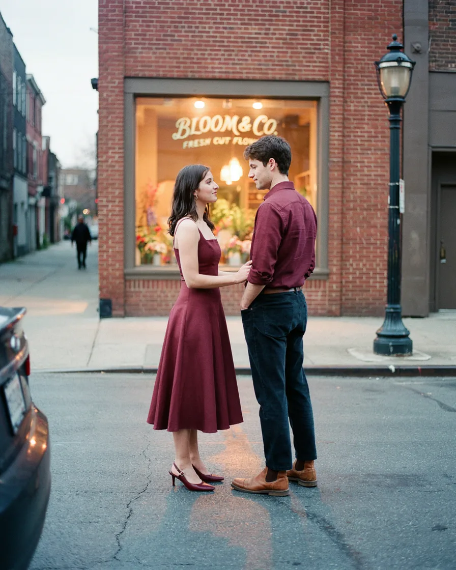
Both in burgundy, one in a dress and one in a casual button-down. This works only if the formality gap stays within one level — same colour will not rescue a genuine formality mismatch, it’ll highlight it.
Level 4: Genuinely Matching, Done Right
19. Matching Sweatsuits for Travel Day
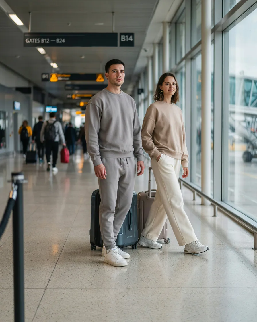
The one context where full matching is an established look rather than a novelty. Airport style has absorbed the coordinated sweatsuit completely, so it reads as a deliberate reference instead of a costume.
Neutral colours, and different cuts within the same set — joggers and a hoodie on one, wide-leg and a crewneck on the other. Same brand, same colour, different shapes.
20. The Same Shirt, Different Way
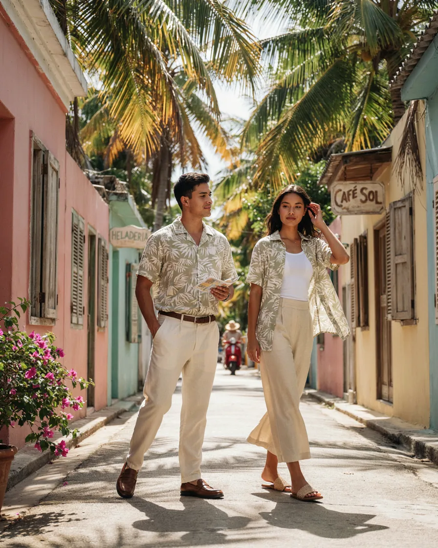
Identical camp collar shirt, styled two ways — fully buttoned on one, open over a tank on the other, or knotted at the waist. Same garment, genuinely different outcome.
This is the smartest thing on this list. You get actual matching, and the styling difference does all the work that a different garment would normally do. It also means one shirt design covers both of you, which simplifies the shopping considerably.
21. Matching Swim, Solid Colour
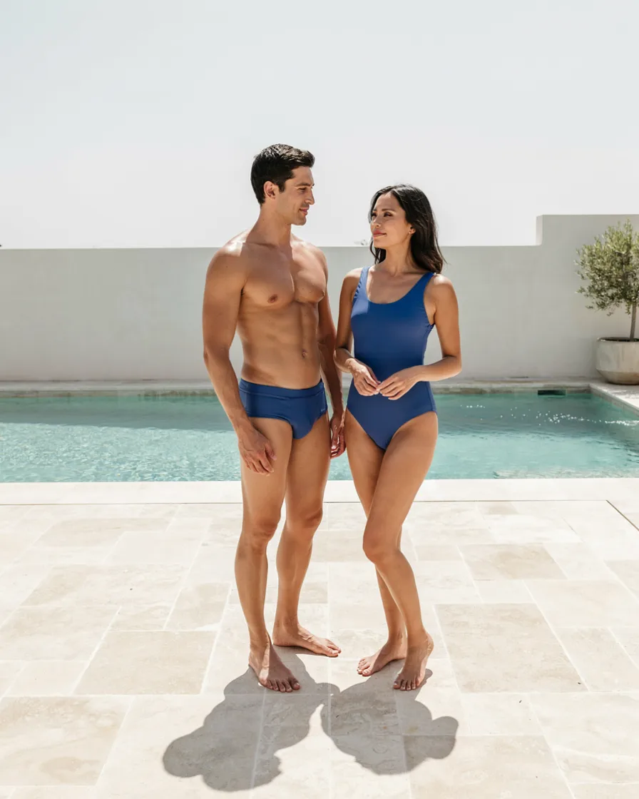
Same swim colour, entirely different cuts. Solid only — matching printed swimwear is the precise point where this tips into costume, and it’s the most common version people get wrong.
22. Matching Knits, Different Colours
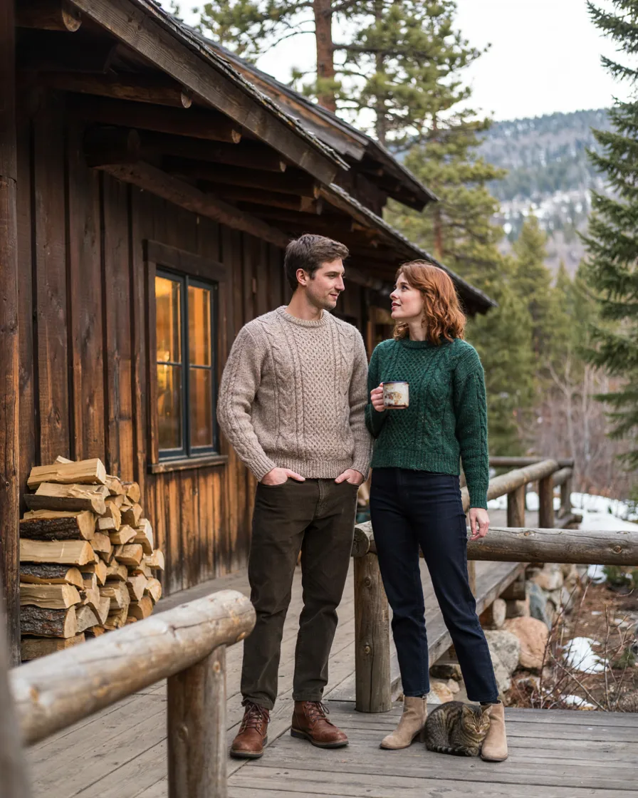
The same sweater style in two colourways. The shared shape does the matching, the colour split keeps it human, and it’s the easiest Level 4 option to actually buy since most knitwear comes in multiple colours.
23. The Same Suit Fabric
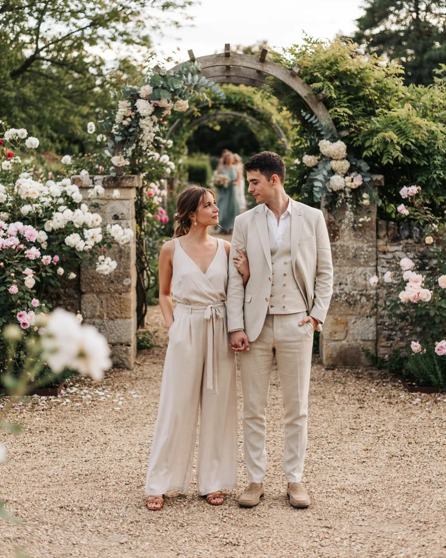
A linen suit and a linen jumpsuit in the same shade, for a wedding or a genuinely nice dinner. Formality is what licenses this — at a certain level of dress, matching reads as considered rather than novel.
24. Matching Outerwear Only
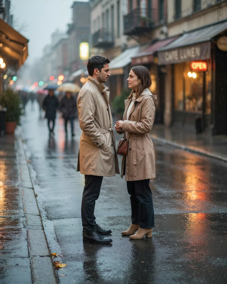
Identical trench or puffer over completely unrelated outfits. The coat matches, nothing else does, and crucially it comes off indoors — so you’re only the matching couple while you’re outside, which is also when the photos happen.
25. Same Hat
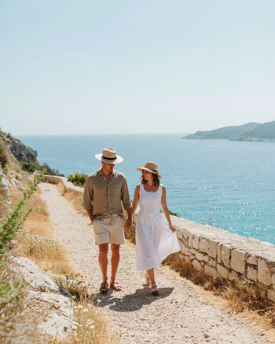
Two straw hats, two caps, two beanies. Small enough to be charming rather than committed, and it’s the easiest thing to take off if you decide halfway through the day that you’re not feeling it.
26. Full Matching, One Photo Only
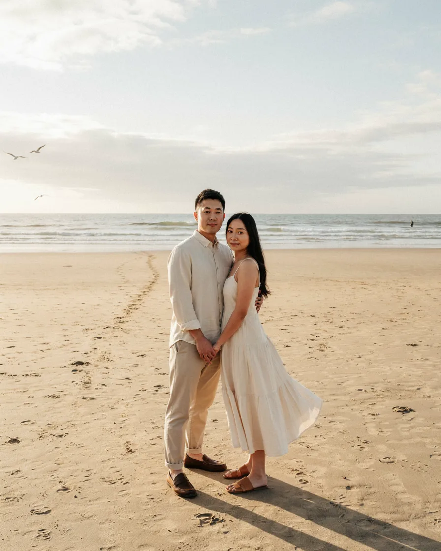
If you want the properly matching shot, take it as one deliberate photo rather than wearing it all day. Change into it, shoot it, change out.
You get the image without spending eight hours as the matching couple at the breakfast buffet — which is genuinely the difference between a photo you love and a day you found slightly embarrassing.
How to Pick Your Level
If one of you isn’t into it, stay at Level 1. A shared palette requires no buy-in beyond agreeing on two colours while packing, and the reluctant person never has to wear anything they’d describe as a matching outfit. This is the honest answer for most couples, and it still solves the problem.
If you’re both into it, Level 2 or 3 gives you visibly coordinated photos without any of the failure modes. Shared fabric is the most forgiving; same colour with different silhouettes is the most striking.
If it’s a milestone trip — honeymoon, anniversary, engagement shoot — Level 4 earns its place for one or two planned looks. Occasion licenses matching in a way an ordinary Tuesday doesn’t.
If you’re travelling with other people, drop a level. Matching reads differently in a group photo, where you become the coordinated pair standing next to five individuals.
Matching by Occasion
Travel days — the one time Level 4 is genuinely the right call. Coordinated sweatsuits or knit sets, neutral colours, comfortable enough for a long flight.
Beach days — Level 1 or 2. Solid swim in a shared palette, linen or crochet cover-ups. Avoid matching prints entirely.
City sightseeing — Level 1. You’re on your feet all day and comfort should decide the outfit; the palette handles the coordination in the background.
Dinner — Level 2 or 3. Shared sheen or a single colour in two silhouettes. This is where coordination pays off most, because evening photos are usually the ones you keep.
Photoshoots — Level 3, plus one Level 4 shot if you want it. Flowing fabrics over structured ones, since movement is what separates good photos from flat ones.
Weddings you’re attending — Level 2, and check the dress code first. Coordinating with your partner is fine; accidentally coordinating with the wedding party is not.
The Things to Avoid Entirely
Novelty text. “Mr and Mrs,” “his queen,” matching slogan tees. There is no version of this that ages well in a photo you’ll look at in ten years.
Identical loud prints. Two people in the same Hawaiian print is the most-cited example of this going wrong, and the reason is structural: loud print plus identical garment leaves the eye nothing else to read.
Costume-adjacent themes. If the two outfits together suggest a concept — sailors, cowboys, a specific decade — you’ve crossed from coordinating into dressing up. Nautical stripes on both people is the most common accidental version.
Matching in every photo of the trip. Coordinate for the days you’ll photograph. Dress normally otherwise.
Buying matching outfits you’d never wear separately. If neither piece works in your regular wardrobe, you’ve bought a costume with a one-week lifespan.
Frequently Asked Questions
How do you match outfits with your partner without looking cheesy?
Share a colour palette rather than a garment, and vary the texture and silhouette. Two people in cream — one in flowing linen, one in structured cotton — reads as coordinated. Two people in the identical shirt reads as a uniform. The formality level matters more than either: matching colours won’t save a photo where one person is dressed up and the other isn’t.
Is it cringe for couples to wear matching outfits?
Identical novelty items usually are. Shared palettes, shared fabrics, and same-garment-different-styling almost never are. Travel-day sweatsuits and coordinated formal wear are two contexts where genuine matching is well established and reads as deliberate rather than novel. The thing that consistently reads badly isn’t matching — it’s clothing that announces the relationship rather than letting the photo do it.
What are the best matching outfits for a couples vacation?
Neutral linen in a shared palette is the most reliable for warm destinations, since the fabric coordinates on its own and it’s also the right practical choice in heat. For travel days, matching sweatsuits or knit sets in a neutral colour. For evenings, shared sheen — satin and silk — in different garments. Avoid matching printed swimwear and anything with text.
Should couples wear the same colour in photos?
The same colour works well as long as the silhouettes differ. Two people in all white where one outfit flows and the other is tailored has depth; two people in white in the same shape merge into a single block. Tonal variation — two shades of the same colour rather than an exact match — is the easiest way to get this right.
What if only one of us wants to coordinate?
Stay at the shared-palette level. Agreeing on two neutral colours while packing requires nothing from the reluctant partner beyond leaving a few items at home, and nobody has to wear anything they’d describe as a matching outfit. The photos still look coordinated, which is the actual goal.
How many coordinated outfits should you pack for a week?
Two or three planned looks is plenty — typically one travel-day pairing, one dinner pairing, and one for whatever the trip’s main photo opportunity is. If you’ve packed within a shared palette, everything else coordinates automatically without being planned, so there’s no need to build a coordinated outfit for every single day.