Here’s something that happens at a lot of weddings, and almost never gets talked about afterward.
The bride spent months choosing her flower palette. She saved hundreds of photos. She knew exactly what she wanted — blush and terracotta and warm cream, or white and deep green and something a little moody. It looked extraordinary on her inspiration board.
And then the wedding day arrived, and the flowers looked… fine. A little flat. Not quite what she pictured. The blush read almost peachy against the linens. The deep burgundy disappeared into the dark corners of the venue. The white roses looked slightly cold in the afternoon light when she’d imagined them warm and romantic.
Nobody said anything. Everyone said it was beautiful. But she knew something was slightly off, and she could never quite articulate why.
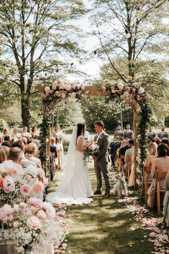
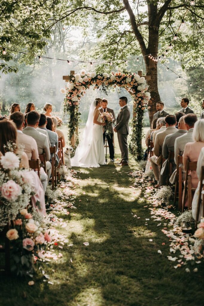
Here’s why: flower colors don’t exist in isolation. They exist in relationship to light, to wall color, to linen color, to the color temperature of the space, and to every other visual element in the room. A palette that looks perfect on a white phone screen — backlit, color-corrected, photographed in ideal conditions — can shift meaningfully when it lands in a real space with its own specific light and texture and color story.
The good news is that this is completely preventable. It just requires one additional step in the planning process that most guides skip entirely.
Here’s how to choose flower colors that work with your venue rather than against it.
Venue Types and What Works in Each
Every venue type has a dominant color story — the tones in its walls, its floors, its light sources, its ambient atmosphere. Understanding that color story is the first step to choosing flowers that enhance it rather than fight it.
The Bright Outdoor Garden
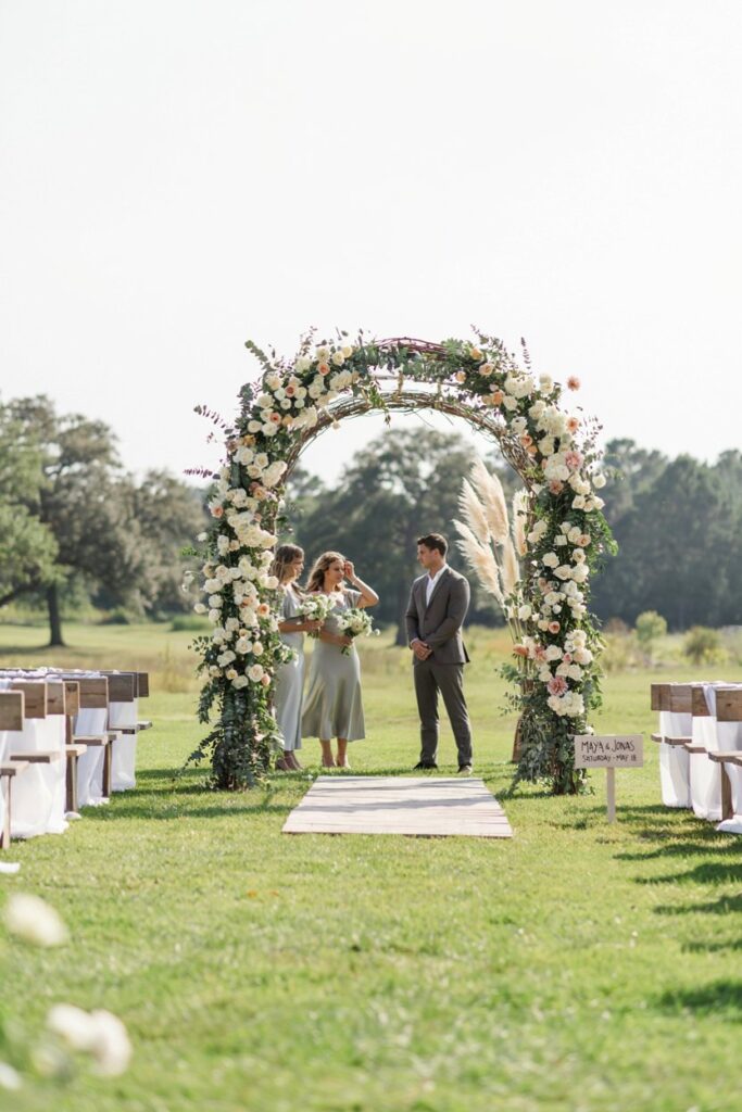
The outdoor garden venue in good weather is the most forgiving environment for flower colors because natural daylight is the most accurate color-rendering light source there is. What you see is largely what you get. But “forgiving” doesn’t mean “anything works” — bright open light can wash out very pale colors and make certain combinations read as harsher or more saturated than they appeared in inspiration images.
Palettes that shine here:
- Soft pastels with white and greenery: Pale lavender, blush, white, and abundant garden-style greenery photograph with a softness in natural light that’s almost impossible to replicate indoors. This is the palette that most closely matches Pinterest inspiration in real life, specifically because it was likely photographed in the same conditions.
- Rich botanical tones: Deep terracotta, rust, dusty rose, and warm cream hold beautifully against green lawn and garden hedges. The warmth of the tones reads as intentional rather than washed out in bright light.
- Saturated bold colors: Outdoors is where genuinely saturated colors — coral, fuchsia, a real orange — get to be their full selves. In artificial or warm indoor light, these colors can tip toward garish. In open natural light, they’re vivid and joyful in exactly the right way.
- White on white on green: Exclusively white flowers with varying textures (ranunculus, garden roses, sweet peas, lisianthus, astilbe) and abundant green foliage in open natural light is one of the most consistently beautiful combinations in outdoor wedding photography. The light catches the texture differences in the white petals and turns what could be monotone into something genuinely nuanced.
The Warm Wood Barn
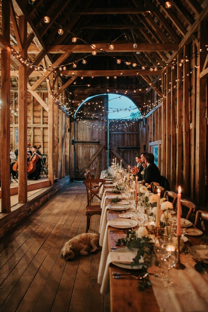
Barn venues have a dominant warm undertone from the wood — often honey, amber, or deep brown — and usually rely heavily on Edison bulbs, candlelight, or string lights for evening ambiance. This creates a beautifully warm color temperature that partners well with certain palettes and actively fights others.
Palettes that shine here:
- Warm neutrals and peachy tones: Champagne, warm ivory, peach, apricot, soft copper. Everything with a warm undertone is going to glow in barn light. This is the palette that feels most cohesive in this setting because it’s working with the color temperature rather than against it.
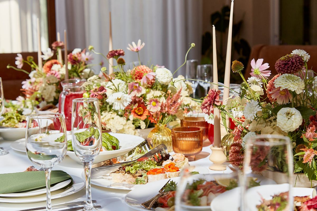
- Earthy and autumnal: Rust, terracotta, burgundy, dried grasses, warm mauves. A barn with earthy florals feels intentional and grounded in a way that reads as sophisticated rather than rustic-cliché.
- Deep jewel tones: Plum, deep wine, antique gold, forest green. In warm, low amber light, jewel tones become richer rather than darker — the light actually enhances their depth. This is one of the only settings where very deep colors are genuinely easy to work with.
- What to be careful of in a barn: Cool-toned palettes — icy lavender, pure white, cool sage, dusty blue — will fight the warm light of a barn. They won’t look bad, but they’ll look slightly dissonant, as if the flowers belong to a different wedding than the venue. If you love these colors, they’ll need more concentrated candlelight or overhead warm lighting to pull them into the setting’s color story.
The White Minimalist Hall
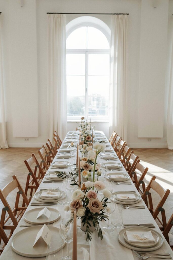
A white-walled, neutral-linen, clean-lined venue is the most genuinely versatile space for flowers because it provides almost no competing color of its own. But this venue type has its own specific trap: because nothing fights with anything, choices can look bolder than expected, and white florals can almost disappear into white walls.
Palettes that shine here:
- One bold color with white and green: A white minimalist venue can handle more saturated color than almost any other setting precisely because there’s nothing competing with it. One real statement color — a true red, a vivid cobalt, a deep emerald — with white and green is extraordinarily striking in this setting.
- Tonal white and cream: Multiple shades of white and cream — not a flat white monoculture, but the variation between warm ivory garden roses, cool white ranunculus, cream sweet peas, and ivory lisianthus — creates visual texture that a white-on-white venue actually shows off because the subtle variations in tone are visible against a neutral background.
- A sophisticated neutral palette with textural depth: Warm beige, taupe, dusty blush, and champagne with varied textures (fluffy pampas grass, dried elements, sculptural greenery) reads as incredibly elevated in a minimal space.
- What to be careful of in a white venue: Very pale pastels — pale pink, pale lavender, pale yellow — can be hard to read against white walls and white linens. They’re not invisible, but they lack the visual contrast to really pop, and photos from this setting can make the florals look washed out.
The Dimly Lit Ballroom
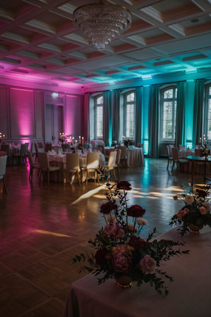
A hotel ballroom or event space with low ambient light, colored uplighting, and chandelier fixtures is probably the most challenging venue for flower colors — and the one where the gap between “what I pinned” and “what it looked like” is widest. Low light makes colors appear deeper and shifts warm and cool tones unpredictably depending on the color of the light sources.
Palettes that shine here:
- High-contrast white against dark: White flowers on dark tablecloths or dark green foliage are the most readable combination in low light. The contrast is what does the work — without it, colors blend into the ambient darkness.
- Metallic and champagne elements: Flowers with any golden, champagne, or peachy warmth will catch candlelight and chandelier light beautifully. Adding metallic elements — gold-edged petals on certain orchids, brass candleholders, gilded accents — to your florals is more effective here than in any other venue type.
- Jewel tones with intentional lighting coordination: Deep plum, garnet, sapphire, and forest green can be breathtaking in a ballroom — but only if the uplighting is warm and the floral colors are deliberate. Talk to your florist and your venue coordinator together about the uplighting colors, because a purple uplighting situation with burgundy florals will neutralize both.
- What to avoid in low light: Pastels, in general, are lost in a dark ballroom. Light pink, pale lavender, peach, and cream all read as similarly indistinct grayish-light in dim ambient light. If you love these colors, you’ll need significantly more candlelight and higher floral volume to make them visible.
The Industrial Loft
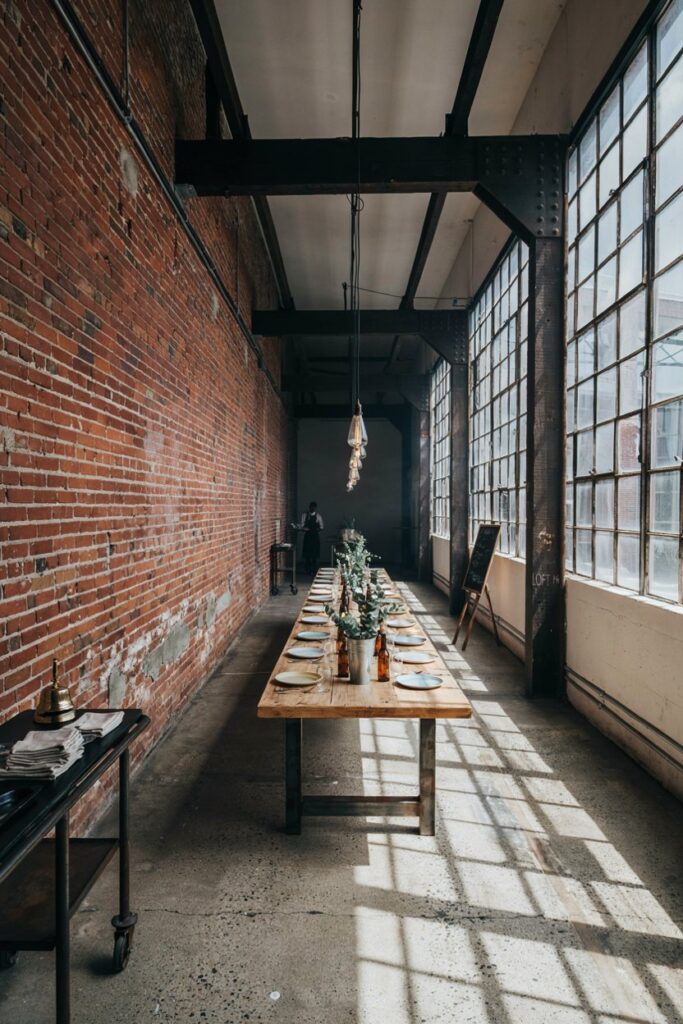
Exposed brick, raw steel beams, concrete floors, oversized factory windows. The industrial venue has a complex color story — the brick brings warmth, the concrete brings cool gray, and large windows bring whatever natural light the orientation and weather allow. This is a setting that rewards intentional contrast rather than trying to blend in.
Palettes that shine here:
- Lush and abundant against the rawness: The most effective approach in an industrial space is to lean into the contrast between the rough architectural elements and incredibly lush, soft, abundant florals. Overflowing arrangements of garden roses, peonies, and sweet peas in soft blush or white against a brick wall is genuinely stunning because the softness against the hard texture does something neither element could do alone.
- Moody and dramatic: Deep burgundy, black-green foliage, dried elements, and dark accents work beautifully in a space that already has an inherent drama to its bones. Lean into the moodiness rather than trying to soften it.
- Botanical and green-forward: Large volumes of varied greenery — eucalyptus, smilax, tropical leaves, ferns — with white or cream flowers reads as a sophisticated urban garden and photographs beautifully against brick and steel.
- Warm amber and copper: In a space with warm brick tones, warm copper, amber, and rust floral elements feel cohesive rather than introduced. Dried grass plumes, warm garden roses in a peachy hue, and amber glass vessels create a warm thread through the industrial setting.
The Lighting Problem — How to Test Your Colors Before Committing
This is the step that almost no wedding planning guide mentions and that makes the most significant difference between the flowers you imagined and the flowers you get.
Visit the Venue at Your Wedding Time
Lighting is completely different at 2pm than at 7pm, and completely different in July than in November. If your ceremony starts at 4 and your reception runs until midnight, the light your flowers need to work in spans from bright afternoon natural light to whatever the venue’s artificial lighting creates after dark. Visit the venue during those hours — ideally on a similar day of the year — and look at how the space actually feels and what colors it seems to call for.
Take Physical Color Swatches
This is the piece of advice that costs nothing and changes everything. Get physical swatches of your palette — actual fabric swatches in your linen colors, paint chips in the color family you’re considering, printed photos that represent your flower palette — and bring them to the venue. Hold them up against the walls. Look at them in the actual light of the space. Take photos of them in that light and look at them on your phone. What you discover in this exercise will often surprise you, and it will be genuinely useful information rather than intuition.
Request Photos from Past Weddings at That Venue
Your venue coordinator has albums and albums of weddings photographed in that space under real conditions. Ask to see them — specifically ask to see a range of color palettes and different times of day. You will start to notice patterns: the color families that look beautiful in that space, the ones that consistently look flatter than expected, the way the ambient light behaves in the evening.
Send These Photos to Your Florist
Your florist may never have worked in your specific venue, but they understand light and color in a way most of us don’t. When you send them photos of past weddings at your venue, they can look at the light quality and color behavior and advise you on how your chosen palette will translate. This is exactly the kind of consultation that separates a great florist relationship from a transactional one.
Trust the Physical Sample Over the Digital Image
When your florist offers to bring sample stems to a meeting — take them up on it, and ask if they’ll meet you at the venue with the samples rather than in their studio. Seeing a garden rose in a specific shade of blush against your actual venue wall and your actual linen swatch is the most accurate information you can have before your wedding day.
Colors That Are Harder Than They Look on Pinterest
Some colors are photographed so beautifully, so consistently, in wedding imagery that they develop a reputation for being easy. They’re not always easy. Here are three that require more care than their Pinterest presence suggests.
Dark Burgundy
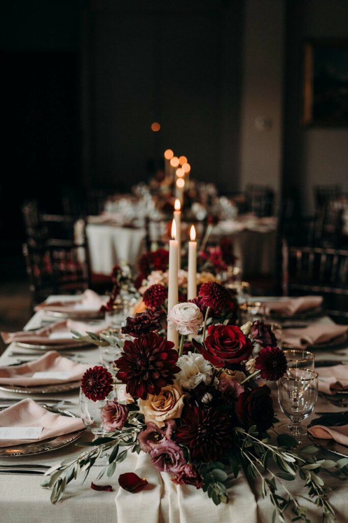
Burgundy is one of the most universally saved wedding flower colors, and it photographs stunningly in the right conditions. But in low light — a dimly lit ballroom, a barn in the evening, a candlelit reception — very deep burgundy, especially in roses and dahlias, can read as nearly black from a distance. The specific red-purple depth of burgundy becomes indistinguishable from very dark charcoal or black once ambient light drops below a certain threshold.
How to use it smartly: pair deep burgundy with a lighter contrasting element — cream, blush, dusty mauve — so there’s a tonal range within the arrangement rather than a single deep tone. Add candlelight specifically and intentionally around your centerpieces. Don’t use burgundy in free-standing arrangements against dark backdrops or in unlit corners of a venue. In natural daylight or good indoor lighting, burgundy is exactly as beautiful as it looks in your saved photos.
Bright Yellow
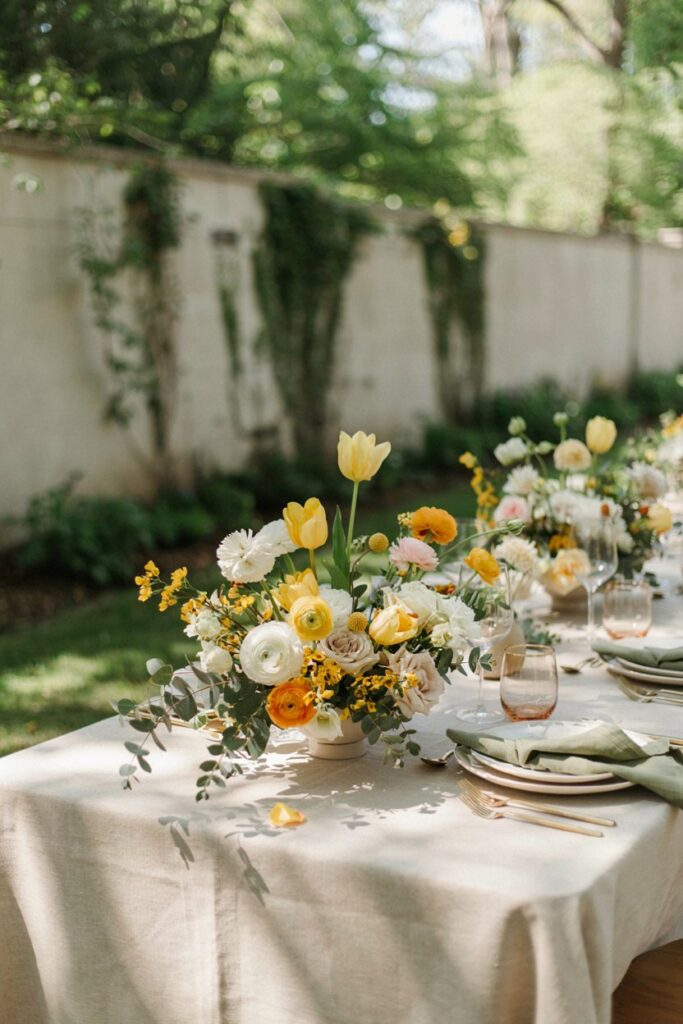
Yellow is one of the most cheerful colors in nature and one of the most challenging to work with in wedding florals. The core issue: yellow is a highly saturated hue that can look warm and sunny in one light condition and slightly sickly or intense in another. More practically, yellow is a strong color that tends to dominate its surroundings — it reads louder than most other hues at the same volume, which means a yellow floral arrangement can take over a tablescape rather than complementing it.
How to use it smartly: use yellow as an accent rather than a base. Touches of bright yellow in an otherwise white-and-green or cream-and-green arrangement create moments of warmth and joy without the dominant-color problem. If you want yellow as a primary palette color, pair it with a similarly saturated partner — a strong cobalt blue, a deep hunter green, a true warm orange — rather than with soft neutrals that it will overpower. Look at past weddings at your specific venue with yellow florals before committing; yellow reads very differently under warm amber light versus cool natural light.
Hot Pink
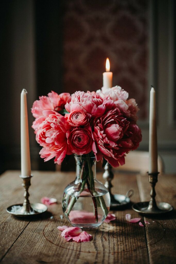
Hot pink is electric in person and in photographs taken in good light. In warm or low-key lighting — the Edison-bulb barn, the candlelit ballroom — it can shift toward a harder, more synthetic-looking magenta that loses the freshness that made it appealing in the first place. Hot pink is also highly saturated, which means it has the same domination problem as yellow: at full strength, it reads more loudly than its proportional presence in the arrangement would suggest.
How to use it smartly: hot pink works best in daytime outdoor or well-lit indoor settings where natural or bright artificial light lets it be its full self. In those conditions, it’s genuinely stunning — vivid, confident, joyful. In low-light settings, consider moving to a raspberry or deep magenta, which holds its color and depth in dim conditions better than a true neon pink. The combination of hot pink with ivory, white, and deep green foliage (rather than with other saturated colors) helps it read as fresh rather than overwhelming.
Questions to Ask Your Florist
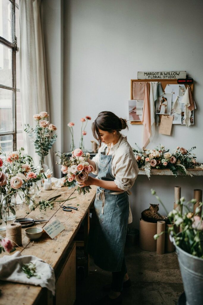
These are the questions that move a florist consultation from “I like these colors” to “I understand exactly how my flowers will look on my wedding day.”
About Your Specific Venue
- Have you worked in this venue before, and if so, what did you learn about how colors read in the light there?
- Based on photos I’m sharing from past weddings at my venue, what would you adjust about my palette?
- What time of day will you be setting up, and how does that compare to when the flowers will be seen by guests?
About Your Specific Palette
- Are there any colors in my palette that concern you photographically, either in low light or under flash?
- Is there a shade within my chosen color family — a slightly warmer or cooler version — that would translate better to my specific venue?
- How will my palette look in the evening versus the afternoon at this venue?
About Specific Flower Choices
- Which specific flowers in my palette have the best color retention throughout the day — which tend to shift or fade?
- For the colors I want, what are the seasonal availability challenges, and what are your recommended alternatives if a specific flower isn’t available on my date?
- For arrangements like my centerpieces, how will this palette read from across a table versus in close-up photography?
About the Testing Process
- Can you bring sample stems to the venue so we can see how these colors actually look in that space?
- Would you be willing to do a sample centerpiece before the final order is placed?
- What photos and references would be most helpful for you to have from me before we finalize the design?
About Potential Problems
- Is there anything about my venue’s lighting or color scheme that you would proactively change about my current palette?
- If the lighting situation turns out to be different than we expected on the day, what adjustments can be made last minute?
- What’s the biggest mistake you see brides make with this type of palette in this type of venue, and how do we avoid it?
The florist who’s right for your wedding will have clear, thoughtful answers to these questions — and will probably add a few observations you hadn’t thought to ask about. That’s exactly what you’re looking for: someone whose expertise goes beyond your brief and who is genuinely invested in what your flowers will look like in your actual space on your actual day.
Trust that person. And take your swatches to the venue first.